Friday 28 February 2014

Cover page progress.


I started my cover page design with my own photos of the leader singing for my band. Iv placed the image filling the whole page like clash and I-D do with their cover page images normally quite close up as well which i took for my cover page and position my model in the middle of the page shoulders in the center looking straight at the reader to attract my audiences attention more. 


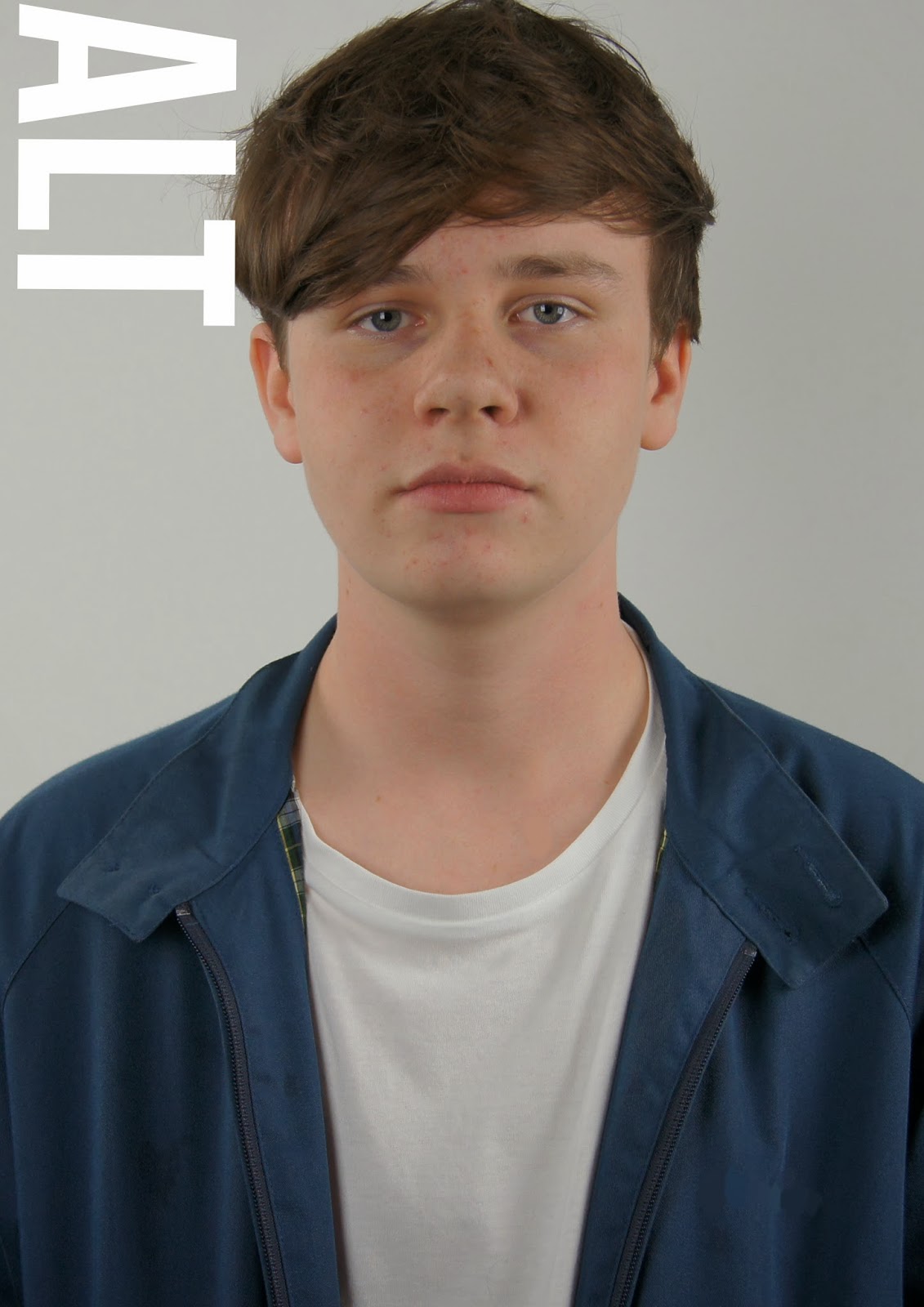
I then place my masthead, which i positioned with influence from I-D magazine, having their masthead going vertically down the side of the cover page and being as my magazine title is short it fitted like I-D to place the title in the position.  


Because half way through my research into my making of my magazine i decided to make it a music and fashion magazine i had to place that somewhere on the cover page to tell the readers. So like clash do with their music/fashion/film magazine i placed mine to fit with the masthead and underneath to give a professional look. 


Then i had a place my subheading onto my page which i fitted onto his jacket as i wanted all text on my cover page to be white and having all text placed within his jacket worked and placed more attention to his face then. Like clash magazine do i place a quote on the cover from the main magazine article to entice readers attention to read on and find out more.


I then placed some more text onto my cover page, some tasters of whats appearing in this magazines issue. Which again i placed within the models jacket at the bottom of the page in line with the sub header, like clash magazine though i wanted this text on the cover page to stand out so i made it a big size to fill the whole gap of the models jacket i had to fill. I did this to make the cover page look organized but still keeping its style and look simply.

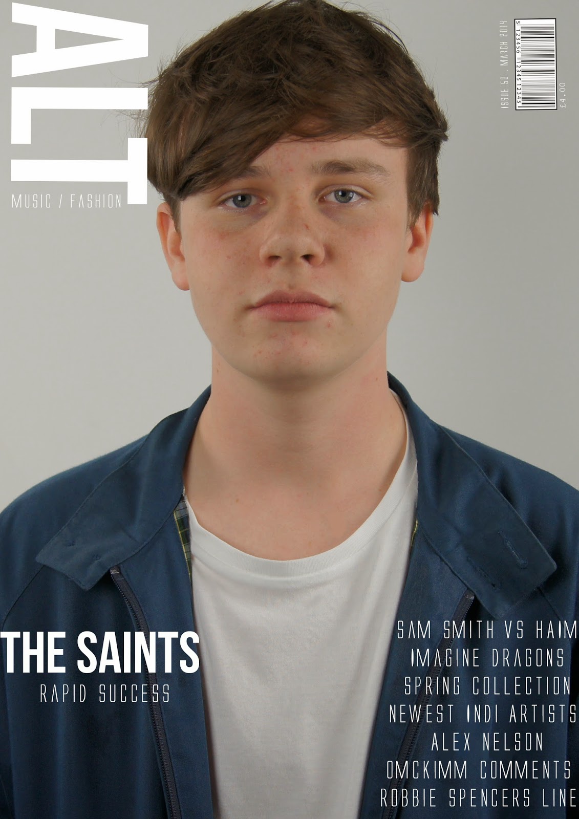
Finally i added my bar code which i placed in right hand side cover but a bit more into the page like with clash does with their bar codes as it looks more sophisticated. Then with the bar code the issue number, date and price in white to carry on the white text on the cover page to look professional and simply.

Wednesday 26 February 2014

Cover page ideas.


I have been very inspired by the clash magazine covers, all issues are very similar and keep their style the same through every magazine. The fonts do vary in the issue by all are very similar, the mast header 'CLASH' is always the same font but the magazine issue title and text on the magazine fonts are all very similar and big they fill the rest of the page that the image isn't filling.

For my cover page looking at clashes magazine cover pages i want mine to look similar. I like their big, bold and type writer fonts they use, also the layout of the text on the page i want to copy even the placing and positioning of the car code i wish to copy. Although i plan to copy this style and layout of the clash magazine i also want to be able to put my own mark on my magazine cover design, make it more my own but influenced by this magazines style and layout design.


Monday 24 February 2014

Weekly target.

This week i plan to start designing or redesigning my cover page, start playing with new and old ideas from my draft with the influence of clash magazines design. Being as i although have done my potential design of my contents page i need to now follow that design throughout my magazine, taking the clash designs into account as well but placing my own mark and ideas into my own magazine cover page design as well.

Sunday 23 February 2014

Contents page progress.

I played around with the white border and black background and the white lines used to under line the headings on the contents page. the positioning of them i kept altering to suit the page and look more professional and organized.
I then added the headers to the page, which i used my own fonts and sizes that i use on the cover page as well to look like its from the same magazine as an alternate to how clash had done their contents page with their chosen fonts. I added a issue date to this magazine above the header and made sure all positioning of the text and under linings fitted together neatly.
Then i added all my text on the pages, i used the same layout as clash did in showing the page numbers and whats on each page but i added my own different page numbers and topics on those pages to match my magazine issue. The clash magazines always give a brief on their main cover story so i did the same about The Saints to give a taste of whats going to be on that page in their interview. I wanted to use the same type of text that clash use that old typewriter look as it looks really retro and cool.

Then finally to add my own touch and design for my magazine i placed my magazine title in the top right hand side in black and in the middle right hand side placed a page number which clash don't use for the contents page but i think it makes mine look more realistic having a page number.

Saturday 22 February 2014

Ideas of fonts.

Clash magazine use capital letters for text on both the contents page and cover page, i have copied this idea. I wanted my text to be typewriter but i also wanted it in capital letters that make text more bold and powerful on a page, so i want to use the font Alien League. But i shall only use this font for the contents page and cover page the double page spread however like clash they use a different font for their article text, which i have decided to use Courier New for my article font and it still looks like typewriting.  

Thursday 20 February 2014

Inspiration for contents page.

This is the contents page design for clash magazine, they use this layout and design for every magazine issue but in different colours depending on the issue even if it doesnt match their cover page or double page spread design. I really like this simplistic style, its really effective being as the contents meant to just say whats in the magazine it does but in a really sophisticated style. I want to copy this style but put my own mark on it for my magazine, to do this i shall play around with colours, different fonts, the text used, adding different items to the contents page. But having this contents page design i shall need to make me cover and double page spread like similar but incorporate the fonts used on the contents page, just to help make all pages look like they are from the same magazine.

Tuesday 18 February 2014

Weekly target.

This weeks target is to make the improvements my teacher has made comments on my draft, then play around with new ideas to use. As i am more influence by clash and their magazine styles i want to make my magazine design look and feel more like clash. I shall need to do some research into clash magazine and then influence their style into my magazine more by altering my ideas and changing my draft.

Wednesday 12 February 2014

Teachers comments on draft.

The title ALT looks like it says ALTL because of the bar code should be placed on the other side of the page. The picture needs to be re-sized and the shadow showing doesn't work and the bar code is too big and fat need to make sure the bar code is the same width as the letters and numbers, add a date and price. The font works well, nice choice.

There is too much shadow in the image and 'The Saints' either needs moving or removing off the page and all the black space doesn't work at the moment. Spelling mistakes need changing and there is too much text below the cover, but try re-sizing all the text. Add more pages and don't just list the names, name the pages, give contents page a page number.

 All the article text is on the same level us drop capitals and make text smaller and include more. Create name of article author and the page number it too big. Put the pull quote in the article mention who photographed the image.

Monday 10 February 2014

Weekly target.

This week i need to take my teacher comments and other students comments on my draft design into account and maybe start improving or redesigning my draft for my final ideas and design to be in on march the 14th. I shall start with my contents page because i wasn't impressed with my draft design for that and have already ideas of what i want to try out and play around with. I also need to help other class mates by commenting on their blogs and draft designs to find improvements for them to improve their work for their final magazine design.

Friday 7 February 2014

Magazine final draft.


These are my final drafts of my front cover, contents page and double page spread. I was able to use all the correct fonts i wanted accept for my double page spread i had to change the front to be more readable as the font couldn't fit on that one page i wanted the text to be placed. So then i had to change the font of the contents page and look like it all came from the same magazine. I am unhappy about my images as they all show shadows due to the lack of lighting i had available and that all my models didn't turn up so i had to improvise and only take an image of two of them for the contents page when their should be four of them, an image of the whole band. I shall be doing my photos again for my final design so thats its exactly what i want it to be and look like.
I did hand in my double page spread with the article written on it but due to complications with the software i used to put the article on the page layout i made on photoshop i couldn't place the final design on my blog, i should be able to after to its been marked on paper.


Thursday 6 February 2014

Edited test shots for magazine


These were the best images from my test shots, i edited them all into black and white but then played around with the brightness and contrasts levels of each image. I liked the black and white look as it looks more professional and sophisticated but thought it suited my simplistic magazine style. The photos them self are all really simple with the white back ground looking at the camera or in a different direction but looking pretty serious as i want my magazine to be taken seriously. This edited images will be used for my draft design of my magazine.