To the examiner,
i hope you enjoy reading through my blog and all the work i have achieve over the last couple of months. I have really enjoyed the AS media course and have put a lot of hard work and dedication into producing my final magazine. All my posts are clearly labelled and can be found in either my blogs archive or label cloud.
Thank you.
Wednesday 16 April 2014
Monday 14 April 2014


Wednesday 9 April 2014

Monday 7 April 2014
Friday 4 April 2014
Tuesday 1 April 2014
Sunday 30 March 2014

Thursday 27 March 2014
Evaluation question 2.
2. How does your media product represent particular social groups?


Tuesday 25 March 2014
Saturday 22 March 2014
Evaluation draft question 7.
7. Looking back at your preliminary task (the school magazine task), what do you feel you have learnt in the progression from it to full product?
I feel the big progression i have made from my preliminary is my skills on photo shop. I also think my understanding of how a magazine is created and developed in the industry has expanding and i now at the end of this project understand the full process of what goes into making a magazine and how in depth this process really is.
My knowledge in photo shop has increased significantly, looking back at preliminary and my basic common layout, editing and precision that i used compared to my final product you can see clearly that its at a much higher standard. Using exposure and brightness tools to enhance my photos quality, using the grid to get precise measurements had enabled me to achieve a much more professional looking final product. I also do feel that due to my practice and deeper understanding of basic editing tools i am now much more efficient when it comes to simply task such as inserting and editing different layers and photos, which is something that during my preliminary task i found quite difficult.
Also my knowledge of the magazine music industry has very much improved and this knowledge came from the amount of research i did into real successful magazines and how they attract their certain audience and genre of music. I also believe i increased this knowledge during the drafting process of my magazine and when i got feedback on my research and drafting from my other peers, this meant that i could improve my work and increase my understanding of how i can make my magazine successful when produced.
Also my knowledge of the magazine music industry has very much improved and this knowledge came from the amount of research i did into real successful magazines and how they attract their certain audience and genre of music. I also believe i increased this knowledge during the drafting process of my magazine and when i got feedback on my research and drafting from my other peers, this meant that i could improve my work and increase my understanding of how i can make my magazine successful when produced.
I think my front cover and contents page of my preliminary to my final design show a key example of progression. The preliminary task was a very brief processes and not much thought went into what i produced and i had no knowledge of other successful music magazines or how the industry worked. I used no precise measurements and it was extremely basic designed, i had no influence of a successful magazine that inspired me, this design was completely off the top of my head. The images for my preliminary were taken in minuets, there's no thought into costume, style or pose that my model did in relation to the magazine genre and target audience. So when looking at my final cover and contents page and the depth of detail i put into the design, the precise placements of the image, subheadings, mast heads and information text all this makes the pages much easier for my target audience to use and more pleasing to look at it as i had some inspiration from successful music magazines of my genre as well.
Friday 21 March 2014
Evaluation draft question 6.
6. What have you learnt about technologies from the process of constructing this product?
Photoshop- i used this program to create my magazine product. Each page i designed was created on Photoshop as you can layer different individual elements of pages over each other, to help create a desired effect which i used to edit all my photos, using a less tool to crop images or adjust brightness and exposure levels of my image, make a layout for my magazine by creating shapes using a shape tool, select and use different fonts available to enhance my magazines authenticity. A useful tool i also used was the colour picker, this allowed me to take a colour from my images or anything on the page and allowed me to use this in another place on the page to help get an exact match of colouring. But i had never used this software before so it took me a while to get the hang of using photoshop as i was very limited in my ability to use the folds and techniques needed and available on photoshop. Although i now after this project in making my magazine am confident in using the software and defiantly think i used it to the best of my ability for my magazine.
Cameras- For the cameras i used a Nikon D3200 which is the schools camera. It takes high quality pictures that i used to put on my cover page, double page spread and single article page. I feel with this camera i got the best quality pictures that i could have possibly taken for my magazine then enhancing their quality using the photo shop editing feature. I did have a Nikon camera myself but due to safety reasons i didn't want to use it for this project, so i already new how to use the camera and its features to its best potential.
Lighting equipment- I used lighting for taking my images for my magazine to help them look more professional. But these lights made them look a better quality due to the fact that the lighting enhanced these images giving my band members a more natural look in front of the camera, all making my works authenticity. I hadn't used any lighting for photography before so it took me a number of shots till i got the hang of how to use them but it was easy to set them up and they had a positive effect on my images.
Computer/Laptops- When creating my magazine and doing all the research and planning for it i used both the school and my own personal laptop to produce this project coursework. My own laptop is an Apple Macbook Pro which i used mostly for the research and planning and blog update posts. I didn't learn anything new about computer technology from doing this coursework but i leant a lot about the softwares and programs i utilised on them.
Blogger- This was the first time id used blogger, therefore i didn't have much knowledge of the website or how to use it. So at the start of the coursework it took me a while to get the hang of it, although it is a pretty simply and easy to learn website. I found the labels very useful as you can group posts and therefore making locating them easier by the set up and layout of my blog making it easier for me to use and follow as well as other users. I made sure i posted regularly of every piece of research and stage of this process in making my magazine onto my blog, starting from my preliminary task to the evaluation.
Scribd- I used scribd for uploading any big and long documents onto my blog that had been done on Microsoft Word, as i could place text and images together more easily this way onto the blog. I used this to place my article, my mood board, Analysis of magazine titles, colour palettes, text fonts and analysis of cover pages, double page spreads and contents pages. Id never used this website before so therefore from this i have learn a new skill in another software.
Internet(Google Chrome/Internet explorer)- I used all these services as part of my research and planning. The search engine available on Google was vital in helping me fine magazine examples, information on institutions and useful images. All these web providers were brilliant in providing helpful facilities. I had used them before so i use them efficiently to their best potential.
Memory Stick- I used this as a back up, to save all my work and research so i had a second back up of this work and nothing could be lost in my magazine design process. I also used this memory stick as a sauce of transport of my work, so i could use and update pieces of work on the school computers to then doing it on my laptop, this gave me more time to complete my work successfully. I had used this device before to improve efficiency.
Microsoft Word 2007- I used this software in order tow rite up my double page spread article and all my analysis's that i made of cover pages, contents pages and double page spreads. I chose to do these pieces of work on a word document because i know it would encourage me to focus on the quality rather then getting distracted on photoshop or on a blog post by making it look good. Also this software had spell check and thesaurus facilities to help improve my texts article and analysis detail. I had used this software a number of times before i was new of all the facilities available and how to use it to its full potential.
Evaluation draft question 5.
5. How did you attract/address your audience?
I designed my contents page the way i did taking into account this target audience and the style i used for my cover page that work welled to follow it through the rest of my magazine to accurately address the audience. The simply, semi literate approach i went for in the language on the contents page was from my genre and audience as i knew my audience wouldn't want to be reading big long words and paragraphs of information as that's not in their simply different style. As i made this contents page not very busy it follows this minimalist and simply style again of not being full with text and images also the same with the mono tonal colour scheme, keeping everything basic and simply in black and white, like the clash magazine does as well which also gives a very sophisticated look that i know my audience would like the look of as it makes them seem respected more and being treated like grown ups and it seems so different and daring as its so simply which will entice them more.
The photograph i chose for my double page spread shows the whole band, to give more of an incite into the whole band together not just the leader singer which that page has the article about. But their natural and simply pose and look they give in this image suits my audience as they are relaxed and simply which makes the band come across as serious and cool. The cover line i placed on the page of the article is a quote from it to entice the audience to want to read on and know more about this band, addressing them directly because this audience are constantly wanting to be up to date with new bands and information which this double page spread does. For my article i decided to chose to do questions and answers as i felt this would most suit my audience my age group, as they won't be interested in reading heavy, uninspiring text. I did start with a paragraph of a brief introduction to my band artist, as this was appropriate with a new up coming band, whilst it also suited the indie\alternative scenester audience who like to be in the know of current new artists. The questions and answers i felt also address my audience as it provides them with relevant information about the band straight away and keeps them in the know. So the very informative style of the article in showing information right away to the audience attracts the audience of indie\alternative scenesters as this suits their needs to be up to date and current.
To conclude i do believe i have tried a lot of methods in an attempt to attract and address my target audience thats appreciated and understood by this audience iv tried to attract. I have done this by researching the target age group and their mannerisms through audience research and creating audience profiles, this was so i could create something that shows and suits the audiences needs and wants.
Thursday 20 March 2014
Evaluation draft question 4.
4. Who would be the audience for your media product?
After my research into my target audience for my indie/alternative music and fashion magazine i came to the conclusion that my audience would be ages between 16-25 is for both male and female but feel that with each individual issue it may differ which sex it appears to more due to who the main story is on and on the cover page. Also from my research on UK tribes, i found the perfect target audience for my magazine, indie scenesters. From looking on UK tribes these tribe are always up to date with current and new artists, they are dedicated to finding the newest music, which are what my audience will want in my magazine to tell them about new artists and fashion trends, keeping them up dated. The genre of my music and magazine is alternative indie and it focuses on new, upcoming artists or bands and up to date fashion trends, basically keeping the young generation up to date with their generation. Also in my research i found that this target audience has an open gap in the market for them to found out the latest indie bands and tunes as well fashion trends which is why on the front cover i mentioned some of the artists and fashion trends inside to show the readers and audience whats available inside.
When designing my magazine i had the fit in with this target audiences style fashion and music to attract them. I tired to style my band artist as one of the target audience so they can relate to this band as one of them but also the magazine, that this magazine follows and holds their style as well by having this band in the magazine. Also being as my magazines not only does music but fashion i had to research my audiences fashion trends to make sure the fashion in my magazine would interest then, such as places like american apparel, zara, well gosh, the wardrobe and other indie fashion shops and styles that would appear in my magazine.
The following are two audience profiles of both sexes within my target audience, after doing research into my audience i think these would be the type of people who would be interested and want to read my magazine.
Name:Abbie Green
Age:20
Interests: Indie/alternative music, fashion, music gigs, keeping up to date with current bands and artists, drawing, designing fashion.
Favourite music bands/artists: Foals, The 1975, Tom Odell, Kodaline, Lana Del Ray, Bastille, Mumford and Sons.
Favourite brands and shops: Topshop, I-D, Dazed, ASOS, House of Holland, Zara, Hotmess, American Appeal.
Profession/occupation: Finial year of uni in London, studying fashion design, in a part time job designing shop window displays for the wardrobe shops around London.
Name:Matthew Jones
Age: 18
Interest: Alternative/indie music, fashion, modelling, music festivals, golf, attending music gigs, art.
Favourite music bands/artist: The 1975, Little Comets, Foals, Kings of Leon, ArticMonkeys, Kodaline.
Favourite brands, shops: Topman, Clarks originals, Sound cloud, Carhart, Wellgosh, Dazed, Clash.
Profession/Occupation: Finishing last year of A levels studying art and design, media studies and graphics, going to uni in Bristol to do graphical design but in a part time job modelling for Hollister.
Wednesday 19 March 2014
Evaluation draft question 3.
3. What kind of media institution might distribute your media product and why?
After doing research into media institutions doing publications of magazines for the music industry i came to the conclusion IPC media would be the be the best media institution to distribute my media product. Earlier on in my research for my music magazine i already did some research into IPC media for being a possible institution to use for publishing my magazine and i found that they are currently going through a huge success with NME and receive nearly 26 million adult views on this magazine. They are also gaining a lot of their success online for media products they distribute which would hugely help and impact my magazine by adding another dimension to my magazine as using the internet and going online is massive in this generation which i am targeting for readers of my magazine.
Therefore with IPC's outstanding publishing reputation i know this institution would take my magazine far within the open market place down to their brilliant credibility and reputation within this market my magazine would fit into, as well as their know how into new publications which would be my magazine, ALT.
Tuesday 18 March 2014
Evaluation draft question 2.
2. How does your media product represent particular social groups?
During the research and planning stages of creating this media product the audience research, audience profile and band profile were very important in making sure my product represented a certain social group. Having this certain social group gave me a clear indication of the type of audience that would be buying my magazine product and also be having a huge impact on the genre and style that will be created by my magazine and band. After doing my research on UK tribes I came to the decision that my magazine would represent the social group of indie scenesters and from this information i found about this social group i made decisions on what genre of music my band would be playing and the style that would magazine would have to use to show this social group i have picked. Choosing a all boy music band was down to my research into current indie bands, which most were all boy bands that apparels and attracts girls as well as boys which suited my target audience of both male and female aged between 16-25. The models used were of my target audience age group which i felt would help incite my audience more as well but they represented my magazine style perfectly. Their simply, bold, youthful and strong looks helped reflect more research i did on photographers (Craig Mcdeand, Richardson and Vauthier) which their style of photography is very much the same as whats used in clash and I-D magazines. The costumes i dressed also represents the social group chosen i aimed my magazine at, their all dressed in white plain tops to make a simply style that indie scenesters style also uses, a simply and unique style which i hoped would incite this audience more. This band that i have created i feel will be an inspiration and idol to my audience by the way i have presented them in my article and photography, they come across as serious music artist but cool, that i think my audience and target social group can relate with and really aspire to and reflect well on my magazine.
Monday 17 March 2014
Draft of evaluation question 1.
1. In what ways does your media product use, develop or challenge forms and conventions of real media products? (i.e. of music magazines)
Again clash magazines graphology, layout and design for their contents page followed the simplistic style that would compliment my genre. So i wanted to copy and carry on this effective contents page design, although i didn't want to completely copy the design so i developed and changed some parts of the design to make it more my own and suit my magazine. I used different fonts and my graphology for my contents page, used a page number and placed my magazine title at the top of the contents page all these alterations and developments of real media product conventions suit my magazine better as the genre and audience is consider more to make my product suit them best.
Although i challenged the normal conventions of a busy cover page and contents page some features like the mast head are conventional of real magazines, its the biggest piece of text on the page so its the first thing a reader is going to see as its big and bold which is the same with the contents page, you know your reading the contents page of that magazine. The title of my magazine (ALT) is a play on words, as my genre is indie/alternative i took alternative but shorten it to ALT. I thought this play on words and directly targeting the audience that will be reading my magazines which are indie\alternative young people, they would want to read the product more.
My double page spread is very much again inspired by Clash and I-D as both these magazines have their own individual approach to page layout, graphology and style that create this minim-elastic and simplistic design that i also am aiming for. So i take both magazines into account, the article its self is very serious but fun to read which suits my audience well of being young and different. The photo used filled the whole right hand side of the page which i found effective as it attract the attention most as it was big, so i had to make it bold by altering the image which clash and I-D do with their images editing and altering to make them look more eye catching to their audience. The page layout very much challenges the convention of being a busy full double page spread as mine is very spacious and bare. But this conformed to my simplistic and minimalstic layout and style i aimed for. These challenges to normal conventions and forms of real media products is something I'm proud about as they all contribute in creating a successful media product with a modern day edge that challenges some forms and conventions of outstanding media products, this giving the magazine its own USP.
Friday 14 March 2014


Thursday 13 March 2014
Notes.
As i have finished my designed already for the deadline this week, most of the time i have been playing around with my designs. Iv been changing the positioning of my images and text to get the full accurate, professional and simply look iv been looking for. I have made no serious changes to my layouts or text at the minuet as im still undecided on weather some positioning need to change or not. This week has just been little alterations and playing around with current ideas iv already done.
Wednesday 12 March 2014
Double page spread altered.

When looking back at my ideas i felt i hadn't included many images and therefore shown a large range of photography skills, so i decided to take some more last minuet images. I felt images were needed of my double page spreads writer, photographer and fashion designer as this is convention of popular music magazines its commonly used in news papers to place an image of the article writers. I felt in this magazine that the article writers are just as important as the band or artist them selves being interviewed, so a little imaged placed near the names of the writer, photographer and fashion designer just to show their importance in this article. Iv also used the same image editing as the big image of the band to bring the all features of the page together nicely.
Monday 10 March 2014
Weekly target.
As the coursework deadline is this friday this week i need to be making the finishing touches to all my pages, the cover, the contents page and double spread to get the better higher grade. As all my ideas have been made i just need to make sure everything is how i want it to be and the ideas all work together to make a magazine, last minuet touches to my work will be needed.
Saturday 8 March 2014
Singe article page progress.

I decided to create a single page of my magazine because i wanted to show the whole article i had written which with my layout i wanted on my double page spread it couldn't show this. As inspired my clash magazine and my research i did into their double page spread and articles i decided to place an image of the lead singer of my band that this part of the interview is interviewing in the center of the page, big to help attract the readers with this main center image.

I then i have to place the text of my article on the page which i decided from my research into single page articles would look professional if the text was organised around the main center image with a white border left round the edge of the article to look neat and sophisticated.

Finally i had to add a page number which like on the double page spread i placed in the middle on the right hand side of the page in the border i left around the article text. I placed it there to connected this page with the other pages i have designed in this magazine.
Thursday 6 March 2014
Double page spread progress.

My double page spread ideas were developed from my draft but i wanted to start from blank. As this time i was more influence by clash i tried to interpret some of their double page spread features. I started with featuring the articles writer, photography and fashion of the double page spread to make my magazine look like a real magazine and professional.

I also wanted to place a pull quote on my double page spread but not in the article as i don't find that effective with my style i am going for. So i decided to place a catchy quote from my article at the top of the page in a bigger and bolder font then the actual article text and any other text appearing on my pages.

Like all common basic articles i had to place a title somewhere so as inspired by clash i copied their article title layout of being in a bigger bolder text and just above the article and towards the center of the page, to make it look more different and unique to common conventional music magazines.

Then to add my article, as i knew my whole article wouldn't be placed on the double page spread what was going to be shown would have to be what attracts the reader the most to carry on through the magazine to read the rest of the article on this music band. The layout of my text was inspired my clash as well, as their layouts are simply but different which is that that will attract my indie/alternative, indie scenesters target audience. So i copied their text layout having the first line of text shorter than the second line of text and starting from the left.

My image was then placed on the other side of the page filling this page. I decided to do some editing to this image i was using as it was an image showing the whole band but it was only the lead that was being interview in this part of the article. I thought having the whole band showing would show the readers the whole picture that they are wanting to know reading this article. In the editing of this image i decided to create the image black and white, but then thought that was too obvious and common, so instead i added a bit of warmth to the image, making it look more grey.

I decided to make this double page look real and professional to add a piece of text at the bottom of the image explaining whats in the image and who the models are. I thought this would look really effective as it shows my thoughts and ideas into the little details needed on a double page spread to look professional.

Then finally the finished touches are the page numbers. Like with my contents page and how clash place their page numbers i placed mine in the middle of the two pages to the side, this looks professional and makes my magazine unique for its own take on layouts and designs.
Wednesday 5 March 2014
Research into double page spread.


All these images are examples of some of clashes most popular double page spreads which i am very much influenced by. I really like the simply and spacious layout of their article and i think its suits my genre and simplistic look i am working towards. I knew from the start of this project that i would have an image filling the whole other page of my double page spread but because i don't think i could fit my whole article onto one page i have decided to create a single separate page that would flow with my double page spread to show the whole of my article and writing skills. I feel even the fonts used are simply, the pieces of information given on the page that they want to read to notice first to entice them are bigger and bolder text then the actual article and information text is smaller and tightly organised to look professional and like an article. Even clashes photography work used on their double page spread are inspirational, their main focus is the models faces and facial expression, which all seem to be serious as their articles are always serious and the magazine them self want to be taken seriously with the information they are given to the readers. All this features are inspiring to my designing of my double page spread and single article page.
Monday 3 March 2014
Weekly target.
This week i shall continue some more progress on my cover page if needed, but start drafting new or improving ideas from my draft of the double page spread and maybe even improve or add to my article as new better ideas for this magazine have been made since my first draft of the article and improvements everywhere will need to be made now.
Friday 28 February 2014
Cover page progress.

I started my cover page design with my own photos of the leader singing for my band. Iv placed the image filling the whole page like clash and I-D do with their cover page images normally quite close up as well which i took for my cover page and position my model in the middle of the page shoulders in the center looking straight at the reader to attract my audiences attention more.
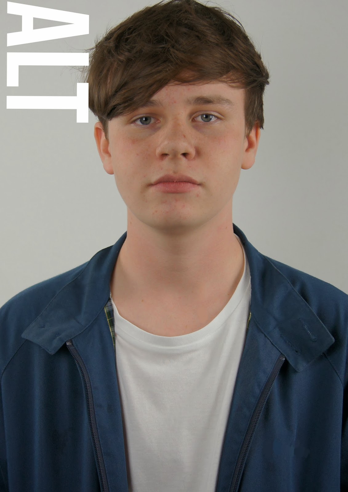
I then place my masthead, which i positioned with influence from I-D magazine, having their masthead going vertically down the side of the cover page and being as my magazine title is short it fitted like I-D to place the title in the position.

Because half way through my research into my making of my magazine i decided to make it a music and fashion magazine i had to place that somewhere on the cover page to tell the readers. So like clash do with their music/fashion/film magazine i placed mine to fit with the masthead and underneath to give a professional look.

Then i had a place my subheading onto my page which i fitted onto his jacket as i wanted all text on my cover page to be white and having all text placed within his jacket worked and placed more attention to his face then. Like clash magazine do i place a quote on the cover from the main magazine article to entice readers attention to read on and find out more.

I then placed some more text onto my cover page, some tasters of whats appearing in this magazines issue. Which again i placed within the models jacket at the bottom of the page in line with the sub header, like clash magazine though i wanted this text on the cover page to stand out so i made it a big size to fill the whole gap of the models jacket i had to fill. I did this to make the cover page look organized but still keeping its style and look simply.
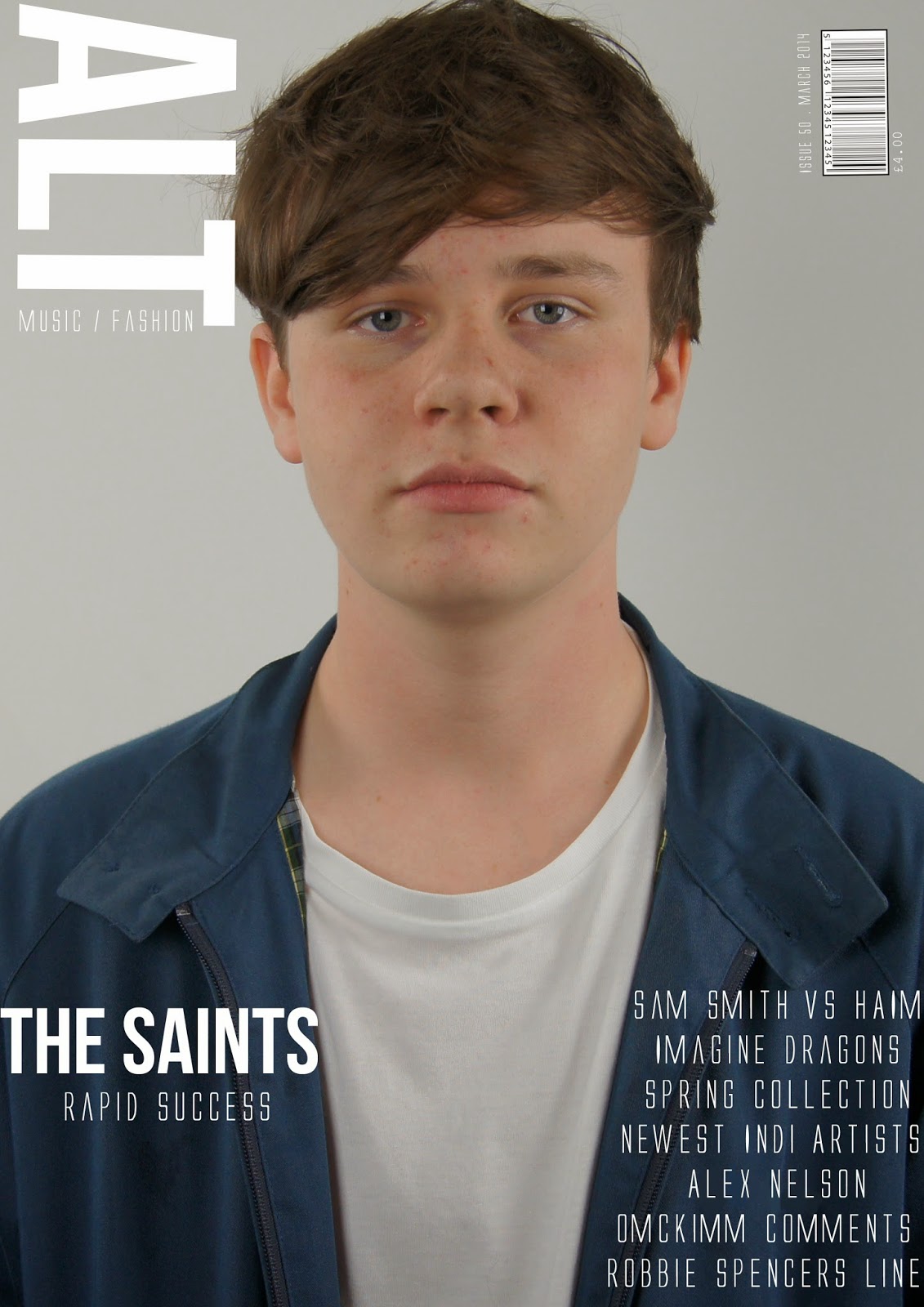
Finally i added my bar code which i placed in right hand side cover but a bit more into the page like with clash does with their bar codes as it looks more sophisticated. Then with the bar code the issue number, date and price in white to carry on the white text on the cover page to look professional and simply.
Wednesday 26 February 2014
Cover page ideas.


I have been very inspired by the clash magazine covers, all issues are very similar and keep their style the same through every magazine. The fonts do vary in the issue by all are very similar, the mast header 'CLASH' is always the same font but the magazine issue title and text on the magazine fonts are all very similar and big they fill the rest of the page that the image isn't filling.
For my cover page looking at clashes magazine cover pages i want mine to look similar. I like their big, bold and type writer fonts they use, also the layout of the text on the page i want to copy even the placing and positioning of the car code i wish to copy. Although i plan to copy this style and layout of the clash magazine i also want to be able to put my own mark on my magazine cover design, make it more my own but influenced by this magazines style and layout design.
Monday 24 February 2014
Weekly target.
This week i plan to start designing or redesigning my cover page, start playing with new and old ideas from my draft with the influence of clash magazines design. Being as i although have done my potential design of my contents page i need to now follow that design throughout my magazine, taking the clash designs into account as well but placing my own mark and ideas into my own magazine cover page design as well.
Sunday 23 February 2014
Contents page progress.

I played around with the white border and black background and the white lines used to under line the headings on the contents page. the positioning of them i kept altering to suit the page and look more professional and organized.

I then added the headers to the page, which i used my own fonts and sizes that i use on the cover page as well to look like its from the same magazine as an alternate to how clash had done their contents page with their chosen fonts. I added a issue date to this magazine above the header and made sure all positioning of the text and under linings fitted together neatly.

Then i added all my text on the pages, i used the same layout as clash did in showing the page numbers and whats on each page but i added my own different page numbers and topics on those pages to match my magazine issue. The clash magazines always give a brief on their main cover story so i did the same about The Saints to give a taste of whats going to be on that page in their interview. I wanted to use the same type of text that clash use that old typewriter look as it looks really retro and cool.

Then finally to add my own touch and design for my magazine i placed my magazine title in the top right hand side in black and in the middle right hand side placed a page number which clash don't use for the contents page but i think it makes mine look more realistic having a page number.
Subscribe to:
Posts (Atom)