Showing posts with label ALT. Show all posts

Monday, 10 March 2014

Weekly target.

As the coursework deadline is this friday this week i need to be making the finishing touches to all my pages, the cover, the contents page and double spread to get the better higher grade. As all my ideas have been made i just need to make sure everything is how i want it to be and the ideas all work together to make a magazine, last minuet touches to my work will be needed.

Monday, 3 March 2014

Weekly target.

This week i shall continue some more progress on my cover page if needed, but start drafting new or improving ideas from my draft of the double page spread and maybe even improve or add to my article as new better ideas for this magazine have been made since my first draft of the article and improvements everywhere will need to be made now.

Sunday, 23 February 2014

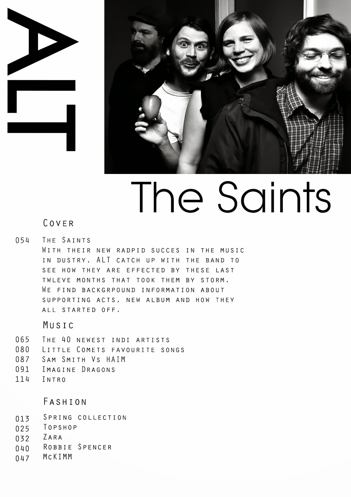
Contents page progress.

I played around with the white border and black background and the white lines used to under line the headings on the contents page. the positioning of them i kept altering to suit the page and look more professional and organized.
I then added the headers to the page, which i used my own fonts and sizes that i use on the cover page as well to look like its from the same magazine as an alternate to how clash had done their contents page with their chosen fonts. I added a issue date to this magazine above the header and made sure all positioning of the text and under linings fitted together neatly.
Then i added all my text on the pages, i used the same layout as clash did in showing the page numbers and whats on each page but i added my own different page numbers and topics on those pages to match my magazine issue. The clash magazines always give a brief on their main cover story so i did the same about The Saints to give a taste of whats going to be on that page in their interview. I wanted to use the same type of text that clash use that old typewriter look as it looks really retro and cool.

Then finally to add my own touch and design for my magazine i placed my magazine title in the top right hand side in black and in the middle right hand side placed a page number which clash don't use for the contents page but i think it makes mine look more realistic having a page number.

Friday, 7 February 2014

Magazine final draft.


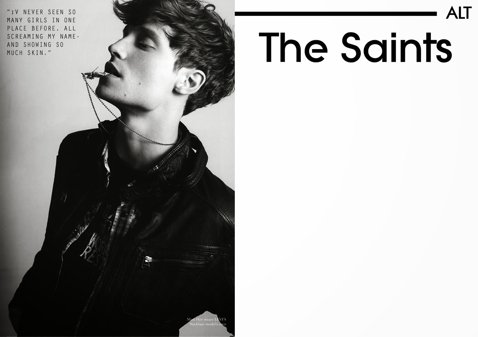
These are my final drafts of my front cover, contents page and double page spread. I was able to use all the correct fonts i wanted accept for my double page spread i had to change the front to be more readable as the font couldn't fit on that one page i wanted the text to be placed. So then i had to change the font of the contents page and look like it all came from the same magazine. I am unhappy about my images as they all show shadows due to the lack of lighting i had available and that all my models didn't turn up so i had to improvise and only take an image of two of them for the contents page when their should be four of them, an image of the whole band. I shall be doing my photos again for my final design so thats its exactly what i want it to be and look like.
I did hand in my double page spread with the article written on it but due to complications with the software i used to put the article on the page layout i made on photoshop i couldn't place the final design on my blog, i should be able to after to its been marked on paper.


Thursday, 6 February 2014

Edited test shots for magazine


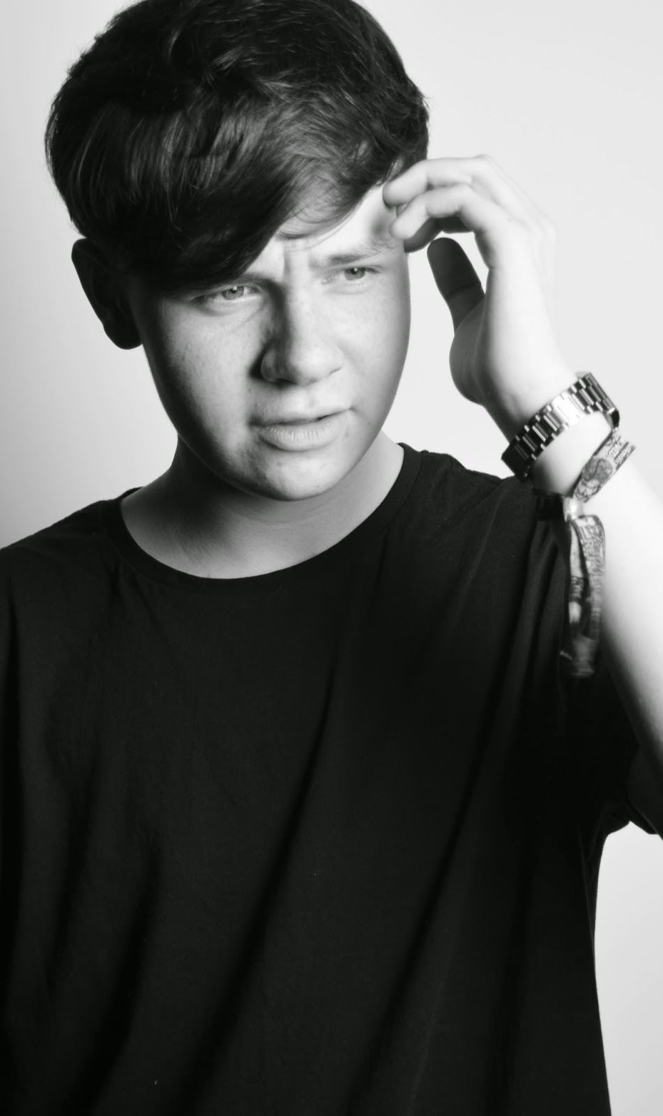
These were the best images from my test shots, i edited them all into black and white but then played around with the brightness and contrasts levels of each image. I liked the black and white look as it looks more professional and sophisticated but thought it suited my simplistic magazine style. The photos them self are all really simple with the white back ground looking at the camera or in a different direction but looking pretty serious as i want my magazine to be taken seriously. This edited images will be used for my draft design of my magazine.

Wednesday, 5 February 2014

Test shots for magazine.

DSC_0208DSC_0207DSC_0206DSC_0205DSC_0204DSC_0203
DSC_0202DSC_0201DSC_0200DSC_0199DSC_0198DSC_0197
DSC_0196DSC_0195DSC_0194DSC_0193DSC_0192DSC_0191
DSC_0190DSC_0189DSC_0188DSC_0187DSC_0186DSC_0185
phillips_chloe's photostream on Flickr.

These are my test shots for my draft of my magazine. Most of these images i don't think are very good because i had only one lighting, not all the models i wanted to take photos of came to the shoot and the cameras shutter was slow so some of them look blurred but they are a starting point. I will be taking more images that will be better and properly used for my real final design magazine.

Friday, 31 January 2014

Draft of my double page spread.


This is a draft of my design for my magazine double page spread, but i haven't taken any real images i may use so i found some fake images as examples. Also the fonts used on this draft are not the fonts i shall be using, they are look a likes of my fonts.

Draft of my contents page.


This is a draft of my design for my magazine contents page, but i haven't taken any real images i may use so i found some fake images as examples. Also the fonts used on this draft are not the fonts i shall be using, they are look a likes of my fonts.