Showing posts with label research. Show all posts

Saturday, 8 March 2014

Singe article page progress.

I decided to create a single page of my magazine because i wanted to show the whole article i had written which with my layout i wanted on my double page spread it couldn't show this. As inspired my clash magazine and my research i did into their double page spread and articles i decided to place an image of the lead singer of my band that this part of the interview is interviewing in the center of the page, big to help attract the readers with this main center image.
I then i have to place the text of my article on the page which i decided from my research into single page articles would look professional if the text was organised around the main center image with a white border left round the edge of the article to look neat and sophisticated.
Finally i had to add a page number which like on the double page spread i placed in the middle on the right hand side of the page in the border i left around the article text. I placed it there to connected this page with the other pages i have designed in this magazine.


Thursday, 6 March 2014

Double page spread progress.

My double page spread ideas were developed from my draft but i wanted to start from blank. As this time i was more influence by clash i tried to interpret some of their double page spread features. I started with featuring the articles writer, photography and fashion of the double page spread to make my magazine look like a real magazine and professional.
I also wanted to place a pull quote on my double page spread but not in the article as i don't find that effective with my style i am going for. So i decided to place a catchy quote from my article at the top of the page in a bigger and bolder font then the actual article text and any other text appearing on my pages.

Like all common basic articles i had to place a title somewhere so as inspired by clash i copied their article title layout of being in a bigger bolder text and just above the article and towards the center of the page, to make it look more different and unique to common conventional music magazines.

Then to add my article, as i knew my whole article wouldn't be placed on the double page spread what was going to be shown would have to be what attracts the reader the most to carry on through the magazine to read the rest of the article on this music band. The layout of my text was inspired my clash as well, as their layouts are simply but different which is that that will attract my indie/alternative, indie scenesters target audience. So i copied their text layout having the first line of text shorter than the second line of text and starting from the left.

My image was then placed on the other side of the page filling this page. I decided to do some editing to this image i was using as it was an image showing the whole band but it was only the lead that was being interview in this part of the article. I thought having the whole band showing would show the readers the whole picture that they are wanting to know reading this article. In the editing of this image i decided to create the image black and white, but then thought that was too obvious and common, so instead i added a bit of warmth to the image, making it look more grey. 

I decided to make this double page look real and professional to add a piece of text at the bottom of the image explaining whats in the image and who the models are. I thought this would look really effective as it shows my thoughts and ideas into the little details needed on a double page spread to look professional.

Then finally the finished touches are the page numbers. Like with my contents page and how clash place their page numbers i placed mine in the middle of the two pages to the side, this looks professional and makes my magazine unique for its own take on layouts and designs.


Wednesday, 5 March 2014

Research into double page spread.


All these images are examples of some of clashes most popular double page spreads which i am very much influenced by. I really like the simply and spacious layout of their article and i think its suits my genre and simplistic look i am working towards. I knew from the start of this project that i would have an image filling the whole other page of my double page spread but because i don't think i could fit my whole article onto one page i have decided to create a single separate page that would flow with my double page spread to show the whole of my article and writing skills. I feel even the fonts used are simply, the pieces of information given on the page that they want to read to notice first to entice them are bigger and bolder text then the actual article and information text is smaller and tightly organised to look professional and like an article. Even clashes photography work used on their double page spread are inspirational, their main focus is the models faces and facial expression, which all seem to be serious as their articles are always serious and the magazine them self want to be taken seriously with the information they are given to the readers. All this features are inspiring to my designing of my double page spread and single article page.


Monday, 3 March 2014

Weekly target.

This week i shall continue some more progress on my cover page if needed, but start drafting new or improving ideas from my draft of the double page spread and maybe even improve or add to my article as new better ideas for this magazine have been made since my first draft of the article and improvements everywhere will need to be made now.

Friday, 28 February 2014

Cover page progress.


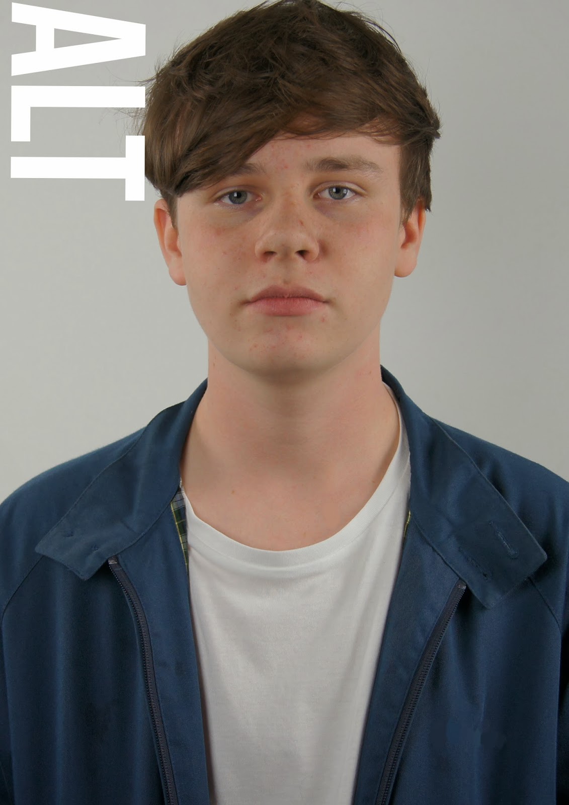
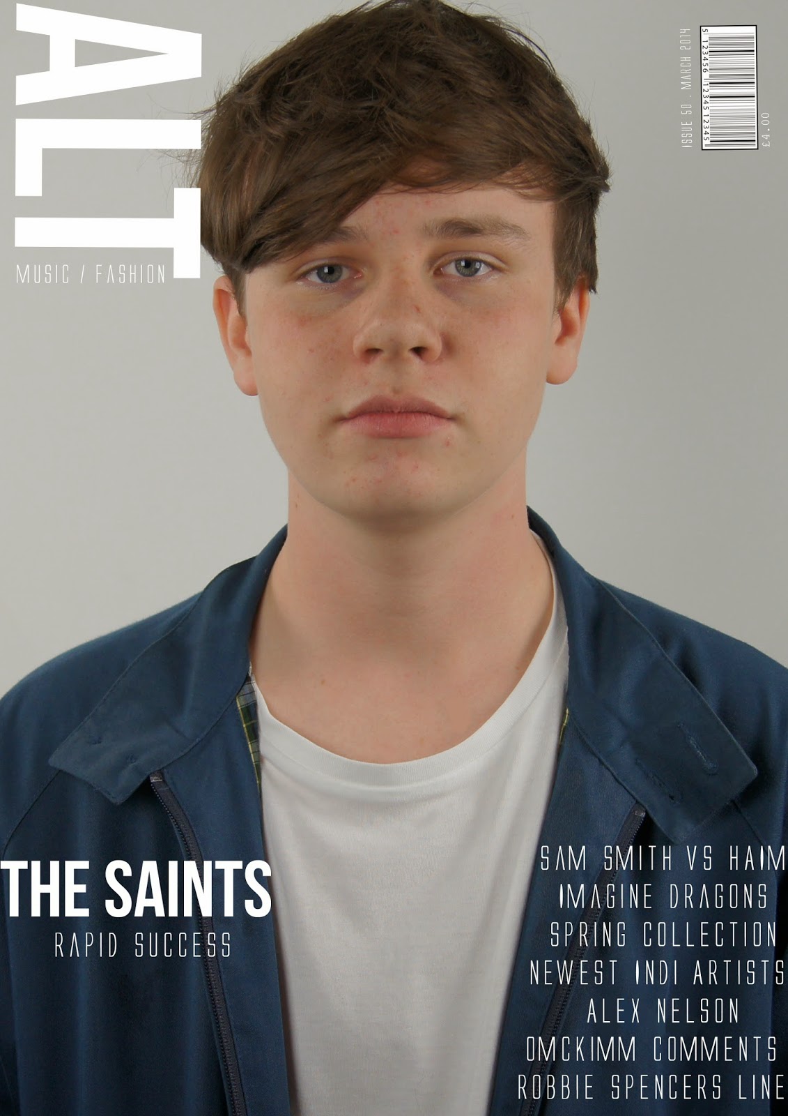
I started my cover page design with my own photos of the leader singing for my band. Iv placed the image filling the whole page like clash and I-D do with their cover page images normally quite close up as well which i took for my cover page and position my model in the middle of the page shoulders in the center looking straight at the reader to attract my audiences attention more. 


I then place my masthead, which i positioned with influence from I-D magazine, having their masthead going vertically down the side of the cover page and being as my magazine title is short it fitted like I-D to place the title in the position.  


Because half way through my research into my making of my magazine i decided to make it a music and fashion magazine i had to place that somewhere on the cover page to tell the readers. So like clash do with their music/fashion/film magazine i placed mine to fit with the masthead and underneath to give a professional look. 


Then i had a place my subheading onto my page which i fitted onto his jacket as i wanted all text on my cover page to be white and having all text placed within his jacket worked and placed more attention to his face then. Like clash magazine do i place a quote on the cover from the main magazine article to entice readers attention to read on and find out more.


I then placed some more text onto my cover page, some tasters of whats appearing in this magazines issue. Which again i placed within the models jacket at the bottom of the page in line with the sub header, like clash magazine though i wanted this text on the cover page to stand out so i made it a big size to fill the whole gap of the models jacket i had to fill. I did this to make the cover page look organized but still keeping its style and look simply.

Finally i added my bar code which i placed in right hand side cover but a bit more into the page like with clash does with their bar codes as it looks more sophisticated. Then with the bar code the issue number, date and price in white to carry on the white text on the cover page to look professional and simply.

Wednesday, 26 February 2014

Cover page ideas.


I have been very inspired by the clash magazine covers, all issues are very similar and keep their style the same through every magazine. The fonts do vary in the issue by all are very similar, the mast header 'CLASH' is always the same font but the magazine issue title and text on the magazine fonts are all very similar and big they fill the rest of the page that the image isn't filling.

For my cover page looking at clashes magazine cover pages i want mine to look similar. I like their big, bold and type writer fonts they use, also the layout of the text on the page i want to copy even the placing and positioning of the car code i wish to copy. Although i plan to copy this style and layout of the clash magazine i also want to be able to put my own mark on my magazine cover design, make it more my own but influenced by this magazines style and layout design.


Monday, 24 February 2014

Weekly target.

This week i plan to start designing or redesigning my cover page, start playing with new and old ideas from my draft with the influence of clash magazines design. Being as i although have done my potential design of my contents page i need to now follow that design throughout my magazine, taking the clash designs into account as well but placing my own mark and ideas into my own magazine cover page design as well.

Saturday, 22 February 2014

Ideas of fonts.

Clash magazine use capital letters for text on both the contents page and cover page, i have copied this idea. I wanted my text to be typewriter but i also wanted it in capital letters that make text more bold and powerful on a page, so i want to use the font Alien League. But i shall only use this font for the contents page and cover page the double page spread however like clash they use a different font for their article text, which i have decided to use Courier New for my article font and it still looks like typewriting.  

Thursday, 20 February 2014

Inspiration for contents page.

This is the contents page design for clash magazine, they use this layout and design for every magazine issue but in different colours depending on the issue even if it doesnt match their cover page or double page spread design. I really like this simplistic style, its really effective being as the contents meant to just say whats in the magazine it does but in a really sophisticated style. I want to copy this style but put my own mark on it for my magazine, to do this i shall play around with colours, different fonts, the text used, adding different items to the contents page. But having this contents page design i shall need to make me cover and double page spread like similar but incorporate the fonts used on the contents page, just to help make all pages look like they are from the same magazine.

Tuesday, 18 February 2014

Weekly target.

This weeks target is to make the improvements my teacher has made comments on my draft, then play around with new ideas to use. As i am more influence by clash and their magazine styles i want to make my magazine design look and feel more like clash. I shall need to do some research into clash magazine and then influence their style into my magazine more by altering my ideas and changing my draft.