Showing posts with label style. Show all posts

Wednesday, 26 February 2014

Cover page ideas.


I have been very inspired by the clash magazine covers, all issues are very similar and keep their style the same through every magazine. The fonts do vary in the issue by all are very similar, the mast header 'CLASH' is always the same font but the magazine issue title and text on the magazine fonts are all very similar and big they fill the rest of the page that the image isn't filling.

For my cover page looking at clashes magazine cover pages i want mine to look similar. I like their big, bold and type writer fonts they use, also the layout of the text on the page i want to copy even the placing and positioning of the car code i wish to copy. Although i plan to copy this style and layout of the clash magazine i also want to be able to put my own mark on my magazine cover design, make it more my own but influenced by this magazines style and layout design.


Sunday, 23 February 2014

Contents page progress.

I played around with the white border and black background and the white lines used to under line the headings on the contents page. the positioning of them i kept altering to suit the page and look more professional and organized.
I then added the headers to the page, which i used my own fonts and sizes that i use on the cover page as well to look like its from the same magazine as an alternate to how clash had done their contents page with their chosen fonts. I added a issue date to this magazine above the header and made sure all positioning of the text and under linings fitted together neatly.
Then i added all my text on the pages, i used the same layout as clash did in showing the page numbers and whats on each page but i added my own different page numbers and topics on those pages to match my magazine issue. The clash magazines always give a brief on their main cover story so i did the same about The Saints to give a taste of whats going to be on that page in their interview. I wanted to use the same type of text that clash use that old typewriter look as it looks really retro and cool.

Then finally to add my own touch and design for my magazine i placed my magazine title in the top right hand side in black and in the middle right hand side placed a page number which clash don't use for the contents page but i think it makes mine look more realistic having a page number.

Saturday, 22 February 2014

Ideas of fonts.

Clash magazine use capital letters for text on both the contents page and cover page, i have copied this idea. I wanted my text to be typewriter but i also wanted it in capital letters that make text more bold and powerful on a page, so i want to use the font Alien League. But i shall only use this font for the contents page and cover page the double page spread however like clash they use a different font for their article text, which i have decided to use Courier New for my article font and it still looks like typewriting.  

Thursday, 20 February 2014

Inspiration for contents page.

This is the contents page design for clash magazine, they use this layout and design for every magazine issue but in different colours depending on the issue even if it doesnt match their cover page or double page spread design. I really like this simplistic style, its really effective being as the contents meant to just say whats in the magazine it does but in a really sophisticated style. I want to copy this style but put my own mark on it for my magazine, to do this i shall play around with colours, different fonts, the text used, adding different items to the contents page. But having this contents page design i shall need to make me cover and double page spread like similar but incorporate the fonts used on the contents page, just to help make all pages look like they are from the same magazine.

Thursday, 6 February 2014

Edited test shots for magazine


These were the best images from my test shots, i edited them all into black and white but then played around with the brightness and contrasts levels of each image. I liked the black and white look as it looks more professional and sophisticated but thought it suited my simplistic magazine style. The photos them self are all really simple with the white back ground looking at the camera or in a different direction but looking pretty serious as i want my magazine to be taken seriously. This edited images will be used for my draft design of my magazine.

Sunday, 2 February 2014

Inspiration for photo shoot.

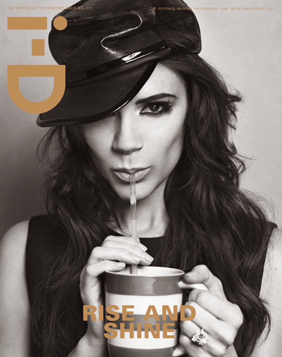
These are images i have found from we heart it, google and photographers that are inspirational for my ideas of my photo shoot. I plan to use the white background to stick with my simplistic look but these images have given my ideas for potential model positions and expression i could use. I did plan to keep the models clothing simply and position or expression but i may play around to make my magazine look a bit more young and hip.